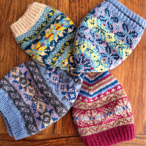
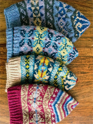
I have been knitting lately; though perhaps not as much or as productively as I would wish. One of my knitting hopes for 2014 was to do more colour-work, and classes with Mary Jane Mucklestone on my transatlantic knitting cruise added both to my enthusiasm and my technique in approaching fair isle knitting. So, I've been knitting hats:
Hats are a perfect project for practicing colour-work. They can be knitted in the round, which is almost compulsory for colour-work. Then, they're just the right size to see if a fair isle pattern works well, but they're not so big that it's a major disaster if the colours or the motif mix don't work too well. I'd bought some 'sticky' fingering weight yarns in a mixture of colours during my visit to the USA - some Harrisville Designs Shetland and some Elemental Affects Shetland Fingering, so I was able to begin by playing around with possible colour combinations. In her classes Mary Jane had given excellent advice on combining and balancing light and dark colours in fair isle knitting, but I found the advice unexpectedly difficult to implement. One of the things I've always taken for granted in my knitting is a capacity to choose and combine colours, so I was unprepared for the amount of experimentation needed to find satisfactory combinations. One thing I think I learned at this stage is that you can never have too many different coloured yarns for fair isle knitting as quite minimal variations in hue can make a significant difference.
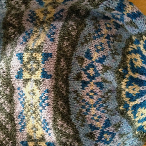
I began with the Shwook hat - a pattern from the admired Shetland knitter, Hazel Tindall.
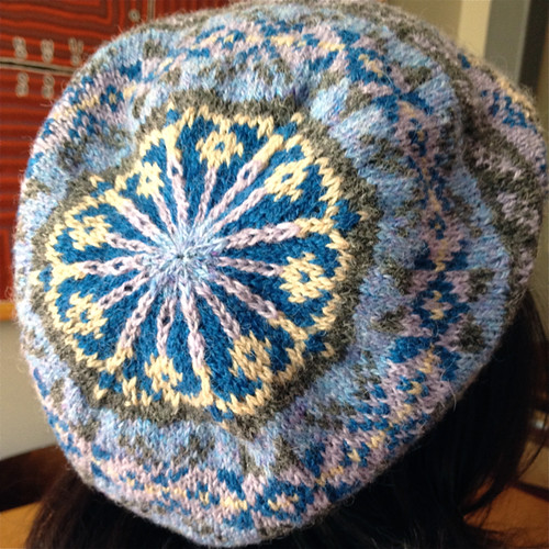
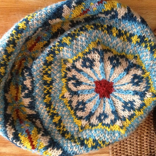
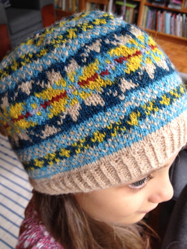
The colours for this hat worked well, but on reflection I thought I had played a bit too safe, and so began another hat. This time I used the basic pattern for the smallest size of the Shwook hat but decorated it with two of the motifs from Mary Jane Mucklestone's '200 Fair Isle Motifs: A Knitter's Directory'. I used one of my favourite colour combinations - yellow and blue. My fair isle pattern designing skills are not yet sufficiently developed to invent a pattern for the crown of the hat, so I've repeated Hazel Tindall's design.
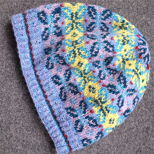
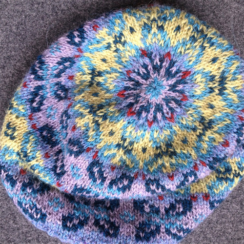
I tried Kyukker, another of Hazel Tindall's hat patterns because I liked its busyness, and was also attracted by the way that a deceptively floral motif had been devised from the squared-off grid that's the starting point for all fair isle. This time the colours didn't work quite so well as the yellow is too bright for the more subtle mauve and blues of most of the hat. I hope I'm learning a bit more about colour combining with each attempt.
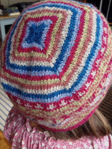
By this stage I was feeling limited by the limited colour palette of my initial yarn purchases and so ordered more yarn, including the lovely rosey colour that was the basis for my next hat. This time I used the idea of Brooklyn Tweed's Turn a Square hat, adapted the pattern for fingering weight yarn and then combined some more of the traditional fair isle motifs from Mary Jane's wonderful book.
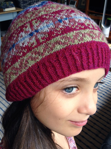
I think I had some vague memory of a Kaffe Fasset hat that combined stripes and florals (or maybe I've invented that recollection) and so striped the crown after completing the fair isle body of the hat. I'm not sure the combination has quite worked, but I think there is a good idea in there somewhere.
Now my problem is what to do with all these hats. My grand-daughter, whom I persuaded to model a couple of them (reluctantly) says they're 'too prickly'. Hmmm. I've offered them to my daughter as last-minute gifts, but she's said, most reasonably, that you can't give someone a warm hat in the heat of a Sydney summer. Maybe I'll just put them away till cooler weather comes and then think again.
Tuesday, December 30, 2014
Friday, December 19, 2014
Bye-bye Brisbane
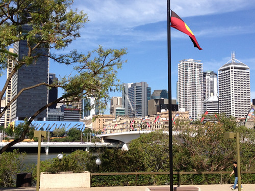
I've just returned from what will probably be my last visit to Brisbane for some time. My daughter and grand-daughter, who have been in Brisbane for nearly seven years, are returning to Sydney, so I'll have no reason for visiting as regularly as I have over those seven years. There are things I've grown to like about Brisbane. Particularly when I've visited in winter, the old tourism slogan of 'beautiful one day, perfect the next' has seemed to describe the bright blue skies, the pollution-free air, the meandering river and the almost tropical landscape with its profusion of flowering trees and bushes. Summer, of course, is a different matter with its heat and humidity. Urgh!
There are two things I'll particularly miss about Brisbane. One is the Tangled Yarns store with its interesting range of yarns, its bright, welcoming space, and its colourful displays. I wrote about my admiration for this store earlier this year. But even if I were continuing to visit Brisbane, this pleasure would no longer be available because the store is, sadly, closing. It will be greatly missed.
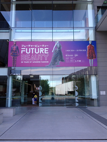
I'm also an avid fan of the gallery complex at Brisbane's South Bank so I took a break from helping with house packing up to visit the latest exhibition at the wonderful Gallery of Modern Art (GOMA) - 'Future Beauty: 30 Years of Japanese Fashion'.
Visitors are not permitted to photograph the items in this exhibition, but the advertisement on the Gallery site gives an impression of the more outrageous designs. What it doesn't really show, however, are the items I found most inspirational; the folded, sculptural, deceptively simple shapes that so revolutionised fashion in the 70s and 80s. There has been some rather critical discussion recently of the phenomenon of displaying 'fashion' in art galleries. But it's a move that has been undeniably popular and has opened galleries to a wider range of people. In the case of this particular exhibition I think it's also not just about what is 'fashionable' but about notions of the body and how it is presented and perceived. It explores how two-dimensional designs can be translated to the unpredictably three dimensional and mobile human form.
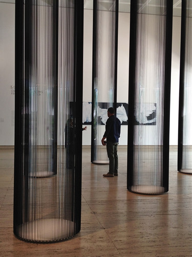
I found this special exhibition both thought-provoking and beautiful, but I was equally engaged by a number of the Gallery's own exhibits as I meandered through the lovely (cool) spaces of the Queensland Art Gallery on my way back to the bus stop. There is a shimmering colonnade that on closer inspection is composed of VHS tape.
The information on the work noted that the Lithuanian artist, Zilvinas Kempinas 'is interested in the way that magnetic videotape holds images of the past, but these will soon no longer be viewable. Rather than its promise of progress, technology often reveals instead dead-ends and monumental failures'. As someone who constantly worries about what will happen in the future to the images and other documentation I now have stored on today's technology, this was a poignant reminder of the probably inevitable transience of the records of our lives.
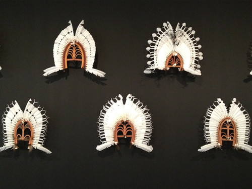
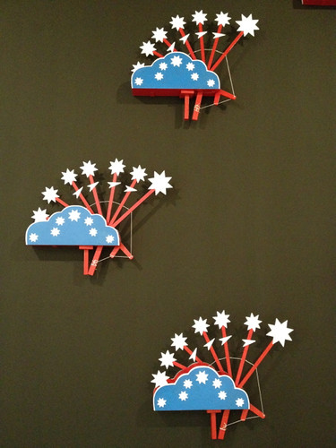
The walls of the main entrance space of the Gallery are currently elegantly hung with dance masks and zugub (dance machines) from the Torres Strait Islands:
One of the things I've admired across my many visits to the GOMA and QAG is their commitment to exhibiting art from the Torres Strait Islands, and the Pacific more generally. Sydney is a very multicultural city and when here I'm conscious, in many different ways, of our location in Asia. But Brisbane reminds me much more immediately of our Pacific connection. Maybe it's the climate, and the visibility of Pacific Islanders within the community, but for me these relationships have been reinforced by the galleries and their collections.
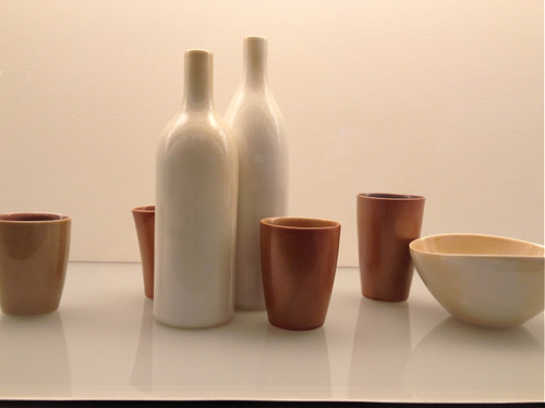
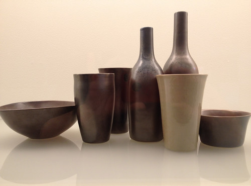
And finally, just before I exited the Gallery, I was distracted by the ceramic collection and its current display of works by Australian potter Gwyn Hanssen Pigott.
I just stand in front of these works and sigh with pleasure. They are perfection. Each of the pots is perfect in itself, but placed together each of the shapes increases the perfection of the others. They remind me of Alberto Morandi's paintings, which also make me sigh with pleasure.
It's not often that you have the opportunity to get to know another city reasonably well through informal visits over some years, when there's no pressure to see as much as possible in limited time, but I've had this opportunity with Brisbane. But for now, bye-bye Brisbane.
Thursday, December 4, 2014
Summer knitting?
Oooof! Yesterday we had 33 degree heat (94 fahrenheit) and 93% humidity - and in the afternoon a thunder storm and downpour of rain where flooded streets were unable to cope with the sudden deluge. Today's predicted to be more of the same. February weather in December. And this comes after the hottest Sydney November on record. Climate change, anybody? So it seems a bit perverse to be blogging about a winter shawl that I've finally managed to block. But knitters will not be surprised by this unseasonable behavior; we know knitting's not a seasonal activity.
This is such a great pattern. It's Ashburn by designer Melanie Berg and combines some of my habitually loved elements - garter stitch and stripes - with blocks of colour, some unexpected textured stitching, and a single picot edge.
I notice from Ravelry that many of the knitters who've completed Ashburn have chosen to do so in bright colours, and it looks wonderful done this way. But I had yarn where the colours melded into one another, and I think it also looks good in this more tonal variation.
I wanted continue my fascination with 'sticky' yarns that are so much a part of knitting in Scandinavia and so I used the Geilsk Yarn that I'd acquired in Copenhagen. Two of the skeins were a generous gift from designer Bente Geil who uses New Zealand wool processed in Denmark for her own range of yarns. The shawl has softened with soaking and blocked beautifully.
At the moment I can imagine few things worse than wearing a woolly shawl. It will need to be carefully stored away for quite a few months. But I know I'll enjoy it next winter....or maybe I could plan some northern hemisphere travel to escape this weather?
Subscribe to:
Posts (Atom)